
Data is King. Data visualization and analytics drive everything from email subscriptions to Ad Clicks, E-commerce, Website Traffic, and more. Large enterprises and startups depend on, work with, and leverage data analytics and data visualization to keep their businesses thriving.
The internet, social media, the banking sector, the IT industry, government systems, and whatnot – You name it, and it runs on data. Therefore, Data Analytics and Data Visualization are more relevant than ever before.
In this blog, we are going to explore data analytics vs data visualization with examples in business, and the tools used for it.
Data Visualization vs Data Analytics Key Differences
Aspect |
Data Visualization |
Data Analytics |
Definition |
The graphical representation of data. | The process of examining data to conclude. |
Objective |
To visually communicate information and insights. | Analyzing and interpreting complex data for decision-making. |
Focus |
Focuses on presenting data trends, patterns, and comparisons. | Focuses on extracting actionable insights and patterns from data. |
Techniques |
Charts, graphs, maps, dashboards. | Statistical methods, machine learning, and regression analysis. |
Data Analysis and Visualization Tools |
Google Data Studio, Tableau and Power BI. | R, Python, Excel, SPSS, SAS. |
Outcome |
Helps users understand data quickly and makes insights more accessible. | Provides deeper insights into data and informs strategic decision-making. |
Users |
Mainly used by business analysts, marketers, and data journalists. | Used by data scientists, analysts, and business decision-makers. |
Scope |
Focused on visual presentation and easy-to-understand charts. | Involves data collection, cleaning, and modeling to gain insights. |
In short, Data Analytics refers to the evaluation and measurement of Data. It is an empirical analysis to interpret, organize, and extract trends and patterns hidden within rows after rows of data.
When data is translated into easy-to-read graphics and presented visually, it is called Data Visualization.
Data visualization services convey heavy data precisely, encoding it in easy-to-understand visuals.
Now, let’s dive into the business applications, methodologies, and techniques of Data Visualization vs Data Analytics.
The Application of Data Analytics in Business
Data analytics has become integral to business operations across various sectors, providing valuable insights and driving strategic decisions. We’ve put together five critical applications of data analytics in business:
- Energy Sector
Data Analytics is crucial in the energy sector. It optimizes energy distribution and predicts consumption patterns. This ensures efficient energy usage and helps balance the grid load, ultimately leading to cost savings and improved energy management.
- Finance and Banking
In the finance and banking industry, data analytics is utilized to detect fraud and manage risk. By analyzing transaction data, financial institutions can identify anomalies and prevent fraudulent activities. Moreover, data analytics helps assess risks related to loans and investments, enhancing decision-making processes.
- Health Care
The healthcare industry leverages Data Analytics to improve patient outcomes and optimize treatment plans. By analyzing patient data, healthcare providers can detect disease trends, predict outbreaks, and tailor treatments to individual patients, leading to better healthcare delivery and cost reductions.
- Retail and E-Commerce
Retailers and e-commerce businesses use Data Analytics to understand customer behavior, manage inventory, and enhance marketing strategies. By analyzing purchasing patterns and customer preferences, businesses can increase sales and reduce operational costs. This is driven by optimum stock levels, personalized marketing efforts, and improved customer satisfaction.
- Government and Public Sector
Governments utilize data analytics for policy formation and resource allocation. They can identify public needs, allocate resources more effectively, and improve public services, ensuring that policies are data-driven and aligned with citizen requirements.
Now, let’s read about the application of data visualization in business through some examples.
Examples of Data Visualization Applications in Business
Data visualization is a powerful tool for businesses, enabling them to interpret complex data sets, identify trends, and make data-driven decisions. Here are some key examples of how different types of data visualizations are applied in various business contexts:
Line Chart

A line chart is commonly used to display trends over time, making it ideal for visualizing changes, fluctuations, and patterns in data. For example, financial analysts frequently use line charts to visualize stock market performance over specific periods, showing the ups and downs of stock prices. This helps investors understand market trends and make informed trading decisions. A report by Statista claims the global stock market was valued at over $95 trillion in 2021. Such figures highlight the importance of tools like line charts in financial analysis.
Bar Graph
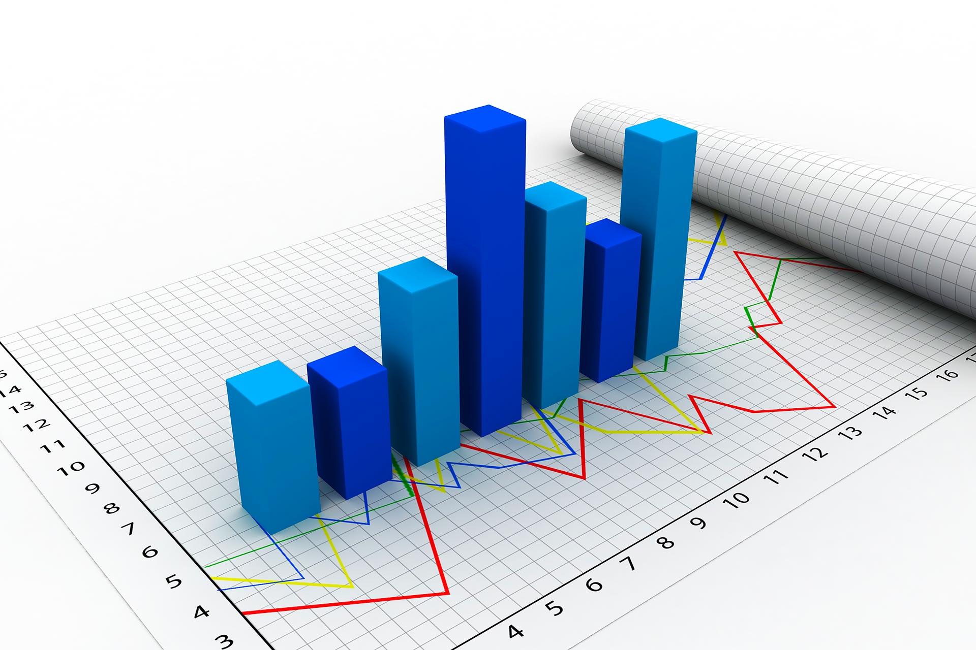
In retail, bar graphs compare sales performance across different products or regions. For instance, a bar graph can show the sales volume of various products, helping businesses identify top-performing items and areas needing improvement. As per Deloitte’s Global Powers of Retailing, understanding sales data through visualizations can significantly impact a retailer’s strategy and profitability.
Pie Chart
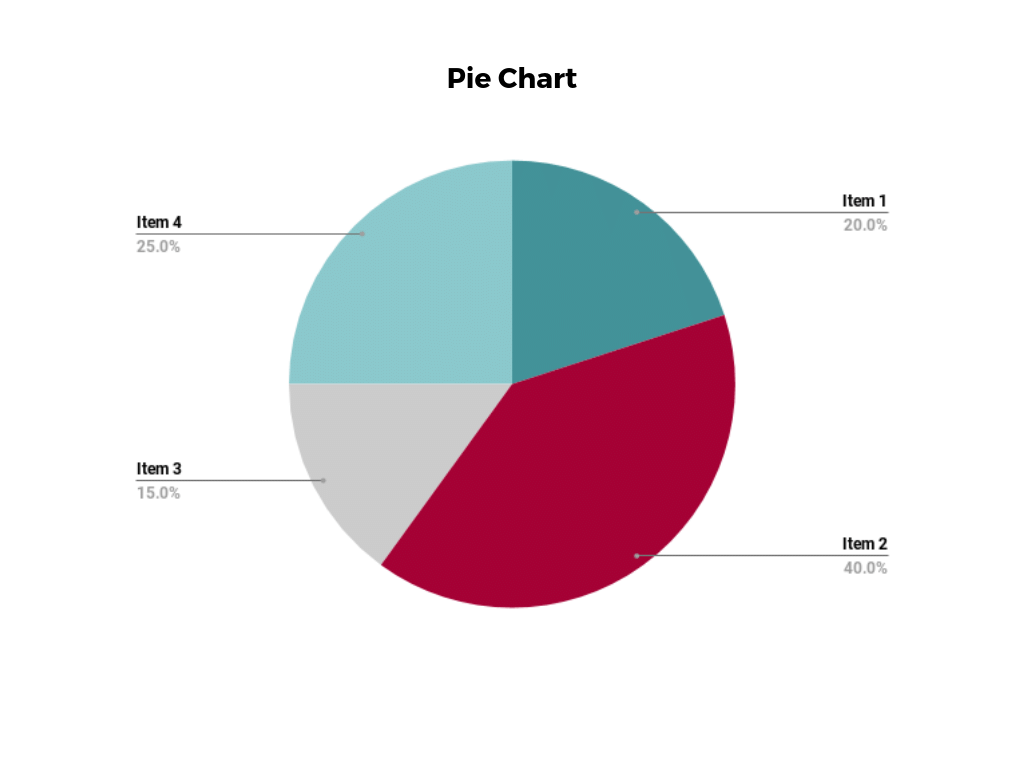
A pie chart represents data as pie slices, illustrating the proportion or percentage distribution of different categories within a whole. This visualization is particularly useful in marketing and market research. For example, a pie chart can depict the market share of various smartphone brands, helping companies understand their competitive position. IDC believes visualizing market share data is crucial for businesses strategizing and adapting to market dynamics.
Scatter Plot
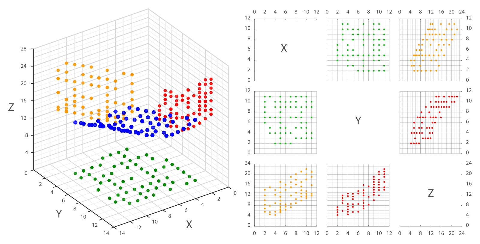
Scatter plots display the relationship between two variables by plotting individual data points on a graph. This is useful for identifying correlations or patterns in data. In human resources, scatter plots can visualize the relationship between employee performance and training hours, helping managers determine the impact of training programs on productivity. A study by LinkedIn found that practical training is linked to improved employee performance, which can be effectively analyzed through scatter plots.
Heat Map
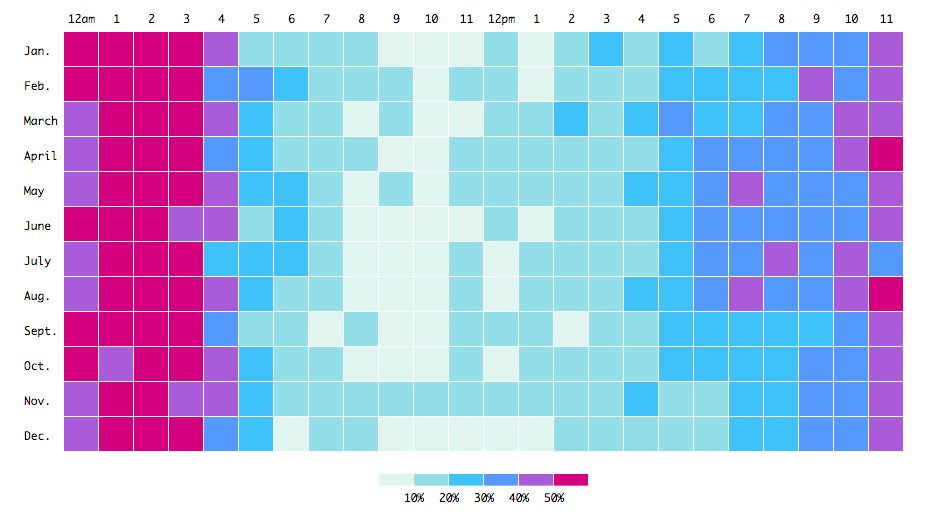
Heat maps use color gradients to represent values in a matrix or table, making them practical for visualizing large datasets and identifying patterns or clusters. Heat maps display website traffic data in web analytics, where brighter colors indicate higher traffic levels. This helps businesses understand user behavior and optimize website design for better engagement. According to Crazy Egg, heat maps are essential for improving user experience and increasing conversion rates.
Geographic Map
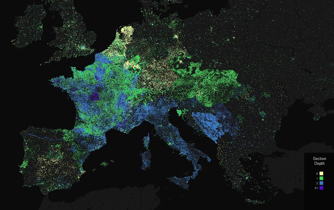
Geographic maps use geographical boundaries to represent data based on location, helping businesses visualize spatial data and regional variations. For instance, a geographic map can display population density across different countries or show the spread of a disease outbreak in specific regions. As noted by Johns Hopkins University, during the COVID-19 pandemic, geographic maps were crucial in tracking and managing the spread of the virus.
Network Diagram
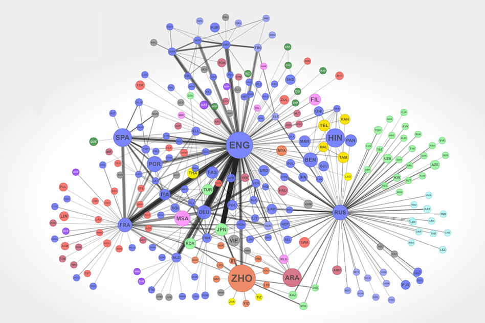
Network diagrams represent relationships between entities or nodes and are used to visualize connections, dependencies, or social networks. In IT, network diagrams help in understanding the structure and connections within a network, which is crucial for managing and troubleshooting network issues. According to Cisco, visualizing network data helps maintain robust and efficient IT infrastructures.
Tree Map
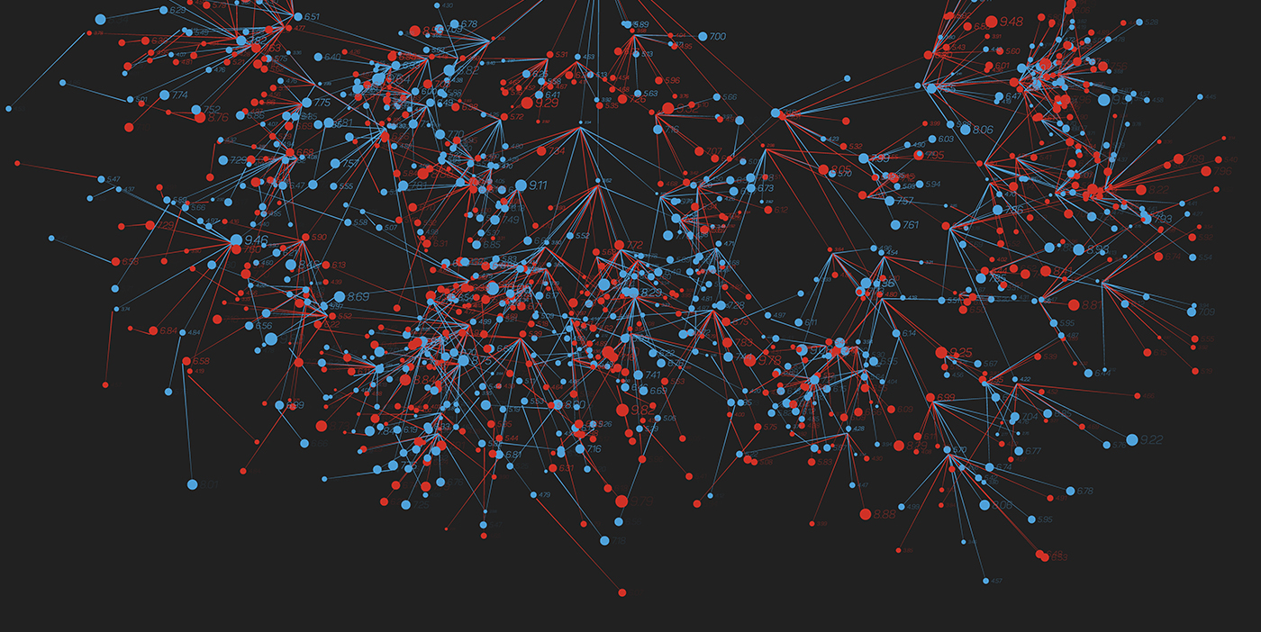
Tree maps represent hierarchical data using nested rectangles of different sizes. They are useful for illustrating proportions and hierarchies within a dataset. In business intelligence, tree maps can display the market share of different industries, with larger rectangles representing larger market shares. This helps businesses quickly understand market dynamics and allocate resources effectively. Gartner reports that visualizing market data through tree maps supports strategic planning and investment decisions.
Fascinating, right? How complex data transforms into unique visuals, representing elaborate data in easily understandable visuals. At AffinityCore, we believe in the Power of Data. Extensive Data Analysis fuels our strategies, and we use advanced Data Visualization techniques to empower our clients. Our experts ensure clear communication of data insights to boost business growth. Properly conveying the correct data is crucial for swift business management, and AffinityCore does it precisely like that.
Discover how AffinityCore’s expertise in staff augmentation, management consulting, and offshore solutions can elevate your team and business dynamics.


