
August,2024
What Is Tableau – What Does Tableau Do and Is It Popular?
Category: Data Analytics Data Visualization

In today’s data-driven world, making sense of large volumes of information is critical for informed decision-making. That’s where Tableau comes in. Tableau is a popular and powerful data visualization tool that helps individuals and businesses transform raw data into clear, interactive, and visually appealing dashboards and reports. Whether you’re tracking business performance, exploring trends, or uncovering insights, Tableau simplifies the process. No advanced coding or technical expertise required.
Tableau is a business intelligence software that enhances Data Analytics and Visualization. Learn what is Tableau, and why it has gained this reputation and what it does in this blog.
What is Tableau?
Tableau is a leading data visualization software used to convert raw data into interactive, easy-to-understand visuals like charts, graphs, and dashboards.
When exploring the Tableau definition, it’s best described as a business intelligence tool that empowers users to analyze data and share insights without needing advanced programming skills.
The Tableau meaning goes beyond just visuals; it represents a dynamic way to understand data, enabling faster, smarter decisions through real-time reporting and intuitive design.
Think about this: Your boss assigns you a task to find patterns embedded in millions of data cells, rows, and columns. Forget identifying patterns; you would have difficulty just reviewing the extensive data. Conventionally, you would dump the information into your database, followed by writing sequel queries to refine your data & gain insights. A time-consuming task, even for experts. Next up, you would have to plot charts to turn your data into a presentable format.
Now, guess what? Tableau enables you to do all this in a fraction of the original time, with a simple drag-and-drop UI. It writes sequel queries at the backend, fetching data from your data source in your desired format. With its high-quality graphics and captivating color schemes, Tableau transforms mundane information into dynamic visuals.
From pie charts and bar graphs to heat maps, tree maps, and scatterplots, Tableau enables you to visualize your data at a granular level and even filter it however you require. That’s how anyone can harness the power of data using Tableau. From small-scale businesses to large enterprises, everyone, everywhere, prefers to utilize Tableau for Data Visualization, Business Intelligence, and Data Analytics.
Now that you have a better understanding of the tool, let’s dig deeper and explore the features and uses of Tableau along with a detailed walk-through.
Features of Tableau
Tableau stands out as a top-tier BI tool because of its powerful features that make data visualization and analysis accessible to everyone, from beginners to seasoned professionals. Here are some of the key features that have contributed to Tableau’s popularity:
- User-Friendly Interface: Tableau’s intuitive drag-and-drop interface allows users to create complex visualizations without needing to write any code. This simplicity enables users with little to no technical background to build dynamic dashboards and reports.
- Data Blending: Tableau enables seamless data blending, allowing users to pull in data from various sources and combine them in one place. Whether you’re working with Excel, SQL databases, or cloud-based data, Tableau effortlessly integrates and blends the data for cohesive analysis.
- Real-Time Data Analysis: Tableau offers real-time data analysis, allowing businesses to make timely decisions based on the most current data available. This feature is particularly valuable for industries where timely insights are crucial, such as finance and retail.
- Advanced Visualizations: With Tableau, users can create a wide variety of visualizations, including heat maps, scatter plots, and geographic maps. These visualizations are not only visually appealing but also highly interactive, allowing users to drill down into data for deeper insights.
- Collaboration and Sharing: Tableau makes it easy for teams to collaborate and share insights. Dashboards can be shared via Tableau Server or Tableau Online, enabling teams to access and interact with data from anywhere, anytime.
- Mobile Compatibility: Tableau’s mobile compatibility ensures that your visualizations and dashboards are responsive across devices. Whether on a tablet, smartphone, or desktop, Tableau adjusts to provide the best viewing experience.
- Security Features: Tableau prioritizes security with robust governance features, allowing organizations to control access and ensure data integrity. This makes it a reliable tool for industries dealing with sensitive information.
How Different Industrial Sectors Use Tableau
Tableau’s versatility makes it a valuable tool across a wide range of industries. Here are a few examples of how different sectors utilize Tableau:
- Finance: Financial institutions use Tableau for real-time data analysis and risk management. Tableau helps finance professionals visualize trends, forecast future financial scenarios, and track key performance indicators (KPIs).
- Healthcare: In healthcare, Tableau is used to track patient outcomes, analyze treatment effectiveness, and manage resources. By visualizing complex data, healthcare providers can make more informed decisions and improve patient care.
- Retail: Retailers leverage Tableau to analyze customer behavior, track sales trends, and optimize inventory management. With real-time data visualization, retailers can respond quickly to market changes and enhance the customer experience.
- Education: Educational institutions use Tableau to analyze student performance, manage enrollment, and allocate resources effectively. By visualizing data, educators can identify trends and make data-driven decisions to improve outcomes.
- Marketing: Marketing teams use Tableau to track campaign performance, analyze customer data, and optimize strategies. By visualizing data from multiple sources, marketers can gain a comprehensive view of their efforts and make adjustments in real-time.
- Manufacturing: Tableau is employed in manufacturing to monitor production efficiency, manage supply chains, and ensure quality control. With Tableau’s real-time data analysis, manufacturers can identify bottlenecks and improve operational efficiency.
How Does Tableau Work – A Walk Through for Beginners
For those new to Tableau, getting started might seem daunting, but the platform’s user-friendly design makes it easier than you think. Here’s a basic walk-through to help you navigate Tableau and start creating impactful visualizations.
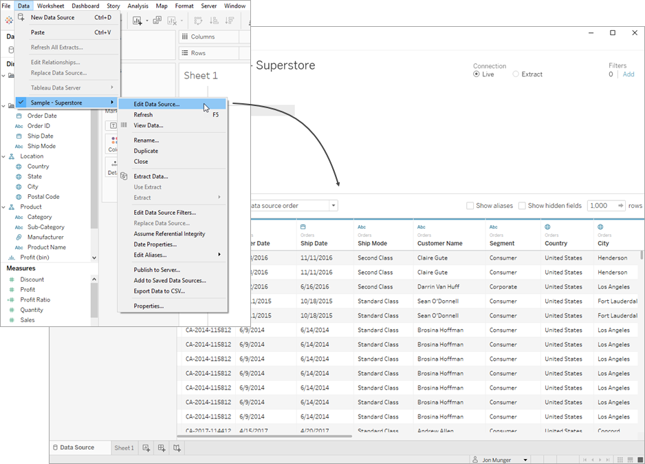
Step 1: Connecting to Data
When you open Tableau, the first step is to connect to your data source. Tableau supports various data formats, including Excel, SQL databases, and cloud-based sources. Once connected, Tableau will display a preview of your data.
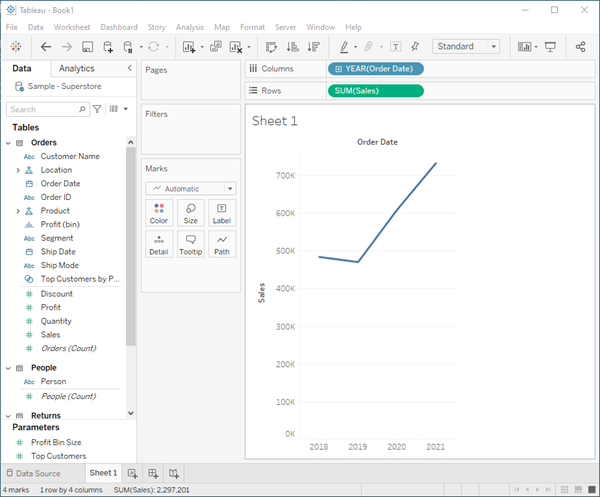
Step 2: Building Your First Visualization
With your data connected, you can start creating visualizations. Simply drag and drop the desired data fields onto the Rows and Columns shelves. Tableau will automatically generate a visualization based on the data you’ve selected.
Step 3: Customizing Your Visualization
Tableau offers a range of customization options to enhance your visualizations. You can change chart types, adjust color schemes, and add filters to make your data more interactive. This flexibility allows you to tailor visualizations to meet your specific needs.
Step 4: Creating Dashboards
After building individual visualizations, you can combine them into a dashboard. Dashboards allow you to present multiple visualizations on a single screen, providing a comprehensive view of your data. You can also add interactive elements like filters and buttons to make your dashboard more dynamic.
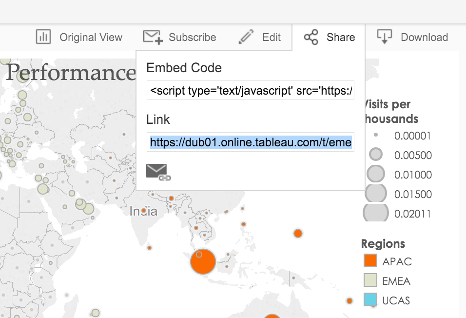
Step 5: Sharing Your Insights
Once your dashboard is complete, you can share it with others. Tableau offers several sharing options, including Tableau Server, Tableau Online, and exporting to PDF or PowerPoint. This ensures that your insights are accessible to your team or stakeholders.
Final Thoughts
Our brief yet detailed guide should provide you with a strong foundation for getting started with Tableau and great knowledge for what is Tableau. By leveraging its powerful features and applying them to your industry-specific needs, you can unlock the full potential of your data. Whether you’re a beginner or a seasoned professional, Tableau’s ability to simplify data analysis and visualization makes it an indispensable tool in today’s data-driven world.
Is your healthcare practices struggling with Data Analytics and Data Visualization? Well, you can outsource and delegate these tedious projects to us while you focus on core strategic operations. The experts at AffinityCore specialize in Data Analytics and Visualization, leveraging top-tier tools like Tableau and Power BI.
Frequently Asked Questions Related to Tableau
What Is Tableau Used For?
Tableau is used for data visualization and business intelligence, helping users analyze and present data through interactive dashboards, charts, and graphs.
When Was Tableau Released?
Tableau was officially released in 2003, offering a user-friendly platform for transforming data into visual insights.
Is Tableau Owned by Salesforce?
Yes, Salesforce acquired Tableau in 2019 to enhance its data analytics and visualization capabilities within the CRM ecosystem.
Is Tableau a Programming Language?
No, Tableau is not a programming language. It’s a visual analytics tool, though it supports custom calculations using Tableau’s formula language.
Who Uses Tableau?
Tableau is used by data analysts, business professionals, marketers, and executives across industries for real-time data analysis and decision-making.
Is Tableau the Same as Excel?
No, Tableau and Excel differ. While Excel is spreadsheet-based, Tableau specializes in advanced data visualization and interactive dashboards.
Is Tableau Difficult to Learn?
Tableau is generally easy to learn, especially for users familiar with data concepts. Its drag-and-drop interface makes data analysis accessible to beginners.